A cafe’s scan journey: from the menu to a return visit
Menu, table card, takeaway cup and guest network, each doing one job. A fictional store example for designing scans that do not pester customers.
Key takeaways
- Different touchpoints in one store should serve different tasks instead of all pointing at the homepage.
- A menu is readable mobile content first, not a poster packed with text.
- Keep a human and paper fallback, and give the staff a maintenance checklist.
The easiest thing to happen once QR codes arrive in a store is that they multiply: one at the door, one on the table, one on the cup sleeve, another at the till. Every one of them says “scan me”, and a customer cannot tell what makes them different. The first step in designing a scan journey is not adding more entry points; it is giving each entry point exactly one main job.
The example below is a fictional cafe, used to show how QRHub can organize these connections. It is a transferable operations approach, not a real customer case, and it comes with no invented revenue or conversion figures.
01 Put each entry point where the task happens
At the door a customer wants to know what there is and whether it is expensive; once seated they want the full menu; holding a takeaway cup they may want to know about the beans or the brewing method. Three moments, three different information needs. Do not ask for a community sign-up at the door, and the cup sleeve does not need to repeat a homepage they have already seen.
Write a specific action next to the code — “view today’s menu”, “connect to guest WiFi”, “see this week’s beans” — so people can judge whether a scan is worth it; a vague “learn more” cannot. Put the social follow after the main task is done instead of using it to block the menu.
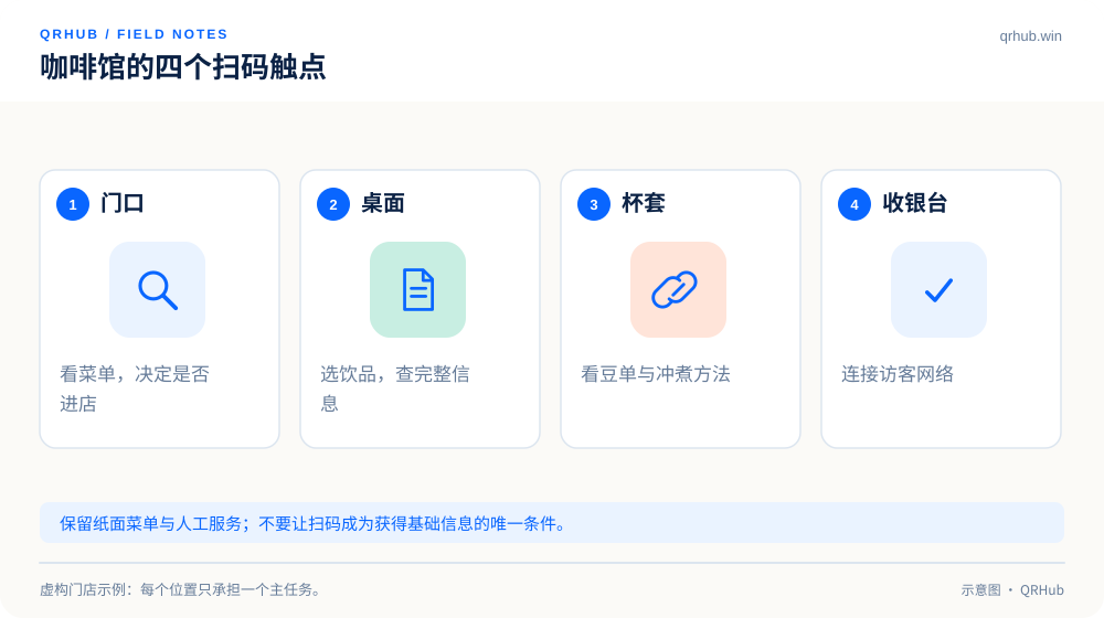
| Touchpoint | Primary task | Where it lands | Who maintains it |
|---|---|---|---|
| Poster at the door | Decide whether to come in | A short menu and opening information | Store manager |
| Table card | Decide what to order | The full mobile menu | Shift lead |
| Takeaway cup sleeve | Learn about the product | The bean list or brewing notes | Product owner |
| Till | Get a way to connect | Guest network or official contact page | Device administrator |
02 Make the menu readable before making it rich
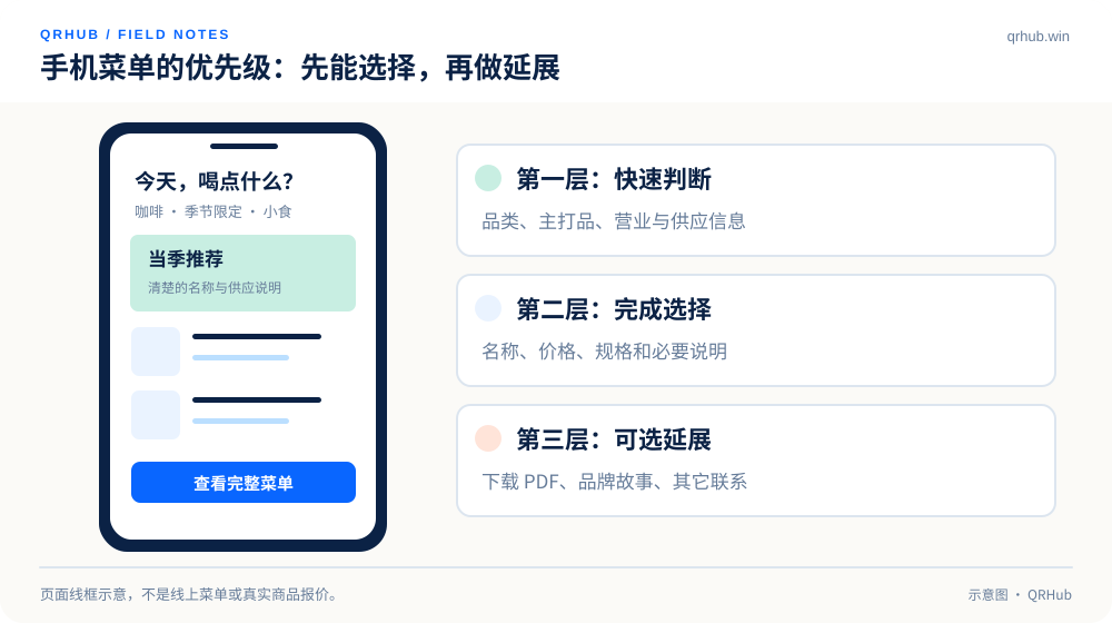
The first screen of a menu should give the categories, the signature items and clear prices. Avoid treating the print PDF as the only mobile menu: when people have to keep zooming in and dragging sideways to read it, the scan succeeded but the reading did not. Keep the PDF download as a supplement and provide a page that reads well on a phone.
In the structure, separate seasonal drinks, regular coffee and food. Mark sold-out items clearly instead of leaving customers to scan and then ask one by one. Information that affects a choice — ingredients, serving hours, substitutions — belongs next to the item; the specific labeling requirements are for the operator to check against their own business.
Images should serve choosing too. One clear representative photo per category with a short description is usually easier to use than scrolling past one large decorative image after another. When you maintain the back office, keep item names and categories stable so regulars do not have to hunt for the same dish again.
03 Updating content does not always mean reprinting
If the menu always lives at one stable address, updating the page content can leave the printed code untouched. If the menu service or the destination address may change later, consider a managed dynamic entry point. The point is to keep “changing the page content” and “changing the address the code encodes” apart instead of tangling the two together.[1]
After publishing a new menu, have another staff member scan the actual codes at the door and on the tables rather than clicking a preview in the back office. Check the prices, the sold-out state, the language and how quickly it loads. If the destination changes, keep a record of the change and a way back, so one bad configuration does not take every table card down at once.
04 Treat the guest network separately from the business network
A WiFi QR code saves customers from typing, but it does contain the network information needed to connect. The common format documented by ZXing carries the network name, the authentication type and the password field; it is a convenience for input, not an encrypted container that hides the password.[2]
Public table cards should therefore point at a dedicated guest network, not the one the tills or the internal office devices use. When the password changes, an old static WiFi code has to be replaced as well. The staff checklist should keep “is the network code still valid?” as its own line instead of managing it like an ordinary menu link.
05 Measure meaningful actions, not one big number
Say the door, the table and the cup sleeve each have their own code identity: now you can compare how visits trend by position. Before comparing, check the time range, how many days each piece was up, how many were placed and how much of the traffic was testing. Fewer visits at the door does not automatically mean the poster failed; it may mean fewer people walk past, the spot is awkward to scan from, or regulars simply come straight in.
Scan counts are not order counts, and still less are they revenue. Without order events and a sound way to join the two, read them as how much an entry point was used rather than as sales attribution. If you use UTM parameters to separate sources, agree on one naming rule and confirm the destination site really does collect that data; the parameters do not build a measurement system by themselves.[3]
06 Leave a path for people who do not scan
Neither the menu nor the network entry should be the only way to be served. Someone with a dead battery, a poor connection or no habit of scanning should still get a paper menu and help from staff. A QR code makes choosing more convenient; it does not hand the responsibility for service over to the customer.
When you open up each day, spend a minute checking the table cards for damage, for stickers someone else put over them, and for landing content that is still correct. Once a week, look at the maintenance record for each entry point. For a store, a clear and stable connection that lasts is usually worth more than one elaborate scan campaign.
Sources and further reading
- MDN, Redirections in HTTP. https://developer.mozilla.org/en-US/docs/Web/HTTP/Guides/Redirections
- ZXing project, Barcode Contents: the conventions for WiFi configuration. https://github.com/zxing/zxing/wiki/Barcode-Contents#wi-fi-network-config-android-ios-11
- Google Analytics, tagging campaign sources with UTM parameters. https://support.google.com/analytics/answer/10917952?hl=en
Related reading