Good looks, good scans: the design limits of a branded QR code
Put the brand into the colors, the margins and the layout around the code instead of the code area, and build reusable acceptance rules for logos, gradients and print.
Key takeaways
- Design the functional area of the code and the brand decoration as two separate zones.
- Error correction is not a license to cover whatever you like; a logo still has to be tested.
- Keep the vector source file and sign the design off on real material at the real size.
A QR code can be part of a brand design, but it is first of all a graphic a machine has to recognize. The most common mistake is not that it looks plain; it is treating the code area, which has to stay stable, as a free canvas. The result looks refined on a monitor, yet once it is stuck on a cup, dropped into a poster or shrunk to a label, people have to keep adjusting the angle before it scans.
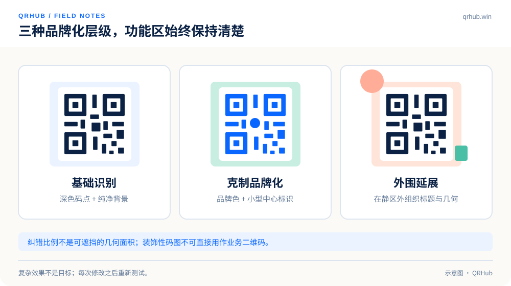
The approach that suits the QRHub look: keep a dark foreground, a clean white background and a restrained corner radius, and move the mint, coral and geometric shapes outside the code area. The brand language stays consistent and the code itself does not have to carry decoration it was never meant to carry.
01 Give the functional area the space it needs
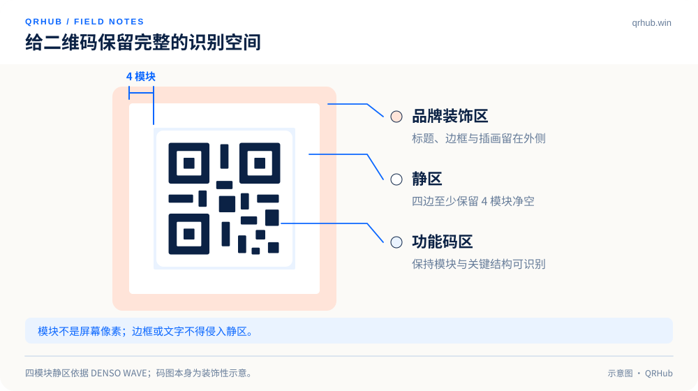
A standard QR Code needs a quiet zone four modules wide around it: a buffer between the pattern and whatever sits next to it. A module is the smallest square in the code. Nothing should be pushed into the quiet zone — no headline, no texture, no border and no background image — and if the exported file already includes that margin, do not crop it back to the edge when you lay the page out.[1]
Treat the code and its quiet zone as one block that nothing may enter, then place prompts such as “view the menu” or “get the manual” outside it. Decoration does not have to hug the edge of the pattern; giving the brand headline and the supporting graphic a little breathing space usually suits a warm-white, uncluttered design better anyway.
02 Start the colors from a reliable baseline
Build the base version with dark dots on a light background first, then try brand colors. Deep blue is an easy starting point inside the QRHub visual system; pale mint and pale coral work better as surrounding backgrounds than as the color of small dots.
With a gradient, check the whole band rather than the darkest endpoint. If part of it comes close to the background color, that becomes a weak spot for recognition. Inverted codes, transparent backgrounds and heavy texture are not ruled out, but they have to be verified against the real background rather than as a preview floating on a white canvas.
There is no need to use identical effects everywhere. Keeping one tested style each for screens, paper and transparent material is easier to maintain than forcing the most elaborate version into every placement.
03 A logo identifies the brand, it does not cover the code
A QR code does carry error correction, but error correction and coverable geometric area are not the same thing. DENSO WAVE describes the recovery percentage as the ability to restore codewords; “this level can recover a certain amount of data” therefore does not translate into “you may cover the same proportion of the image”. Raising the error correction level also affects data capacity and the size you need.[2]
Start with a small logo, keep enough clean background, and stay clear of key structures such as the position patterns. After you change a logo, regenerate the code and test it again rather than pasting a graphic over an exported PNG. For small labels, dropping the central logo and putting the brand name outside the code is often the clearer trade-off.
| Area | The rule to keep | Where the branding goes |
|---|---|---|
| Main code area | Clear light-dark contrast, structure not rewritten at will | Restrained changes to color and module shape |
| Quiet zone | Continuous, clean, free of text and texture | No decoration |
| Surrounding layout | A clear action prompt and generous white space | Brand headline, geometric shapes, supporting colors |
| Central mark | Small and clear, regenerated and tested | A simplified logo icon |
04 Do not let the export break the design
Keep an SVG as the source file you can go on scaling, and export a PNG for the actual placement. SVG is a vector format, but screenshotting, compressing or stretching it afterwards still throws that advantage away.[3]
Scale proportionally on the page; do not stretch a square code into a rectangle. In print layout, avoid fold lines, seals, strong reflections and noticeably curved surfaces. “It looks clear on screen” is not an acceptance criterion on its own: look at a proof at the final size, especially when the code carries dense content.
05 Keep a short acceptance checklist
Split acceptance into three rounds. Round one checks the encoded content: domain, path and public permissions. Round two checks the graphic: quiet zone, proportions, logo and colors against the design rules. Round three checks the finished piece, covering at least the phones, materials, scanning distances and lighting you expect.
When something goes wrong, change one thing at a time. Strip the decoration and the logo first, fall back to base colors, then look at size and content density. That finds the cause instead of treating “try a different random style” as a fix. Record the version that passed and make it the team’s default template.
Put the brand in the right place
A clear action headline, one necessary line of explanation, a clean QR code and a little geometric decoration are enough to make a complete brand touchpoint. A good branded code does not look unlike a QR code; it is instantly readable as yours and still lets people scan it without effort.
Sources and further reading
- DENSO WAVE, guidance on the four-module quiet zone for QR Codes. https://www.qrcode.com/en/howto/code.html
- DENSO WAVE, Error Correction Feature: the recovery percentage applies to codewords. https://www.qrcode.com/en/about/error_correction.html
- MDN, SVG: Scalable Vector Graphics. https://developer.mozilla.org/en-US/docs/Web/SVG
Related reading